ScoreAi: match search redesign that lifted engagement
ScoreAi had something most products would envy: real demand. People arrived wanting matches. But the match search experience leaked that intent before users reached the actions that mattered, and no amount of traffic could fix a flow that tired people out.
I rebuilt it as a conversion problem first and a visual problem second.
A discovery flow earns its keep when a first-time user can scan it once, understand what to do, and act — which is why this rebuild started from hierarchy and onboarding, not pixels.
Where the leak was
The old flow made users work to understand what came next. Results blurred together, the primary action hid below supporting content, and first-use sessions had no guided path — so intent cooled before discovery started.
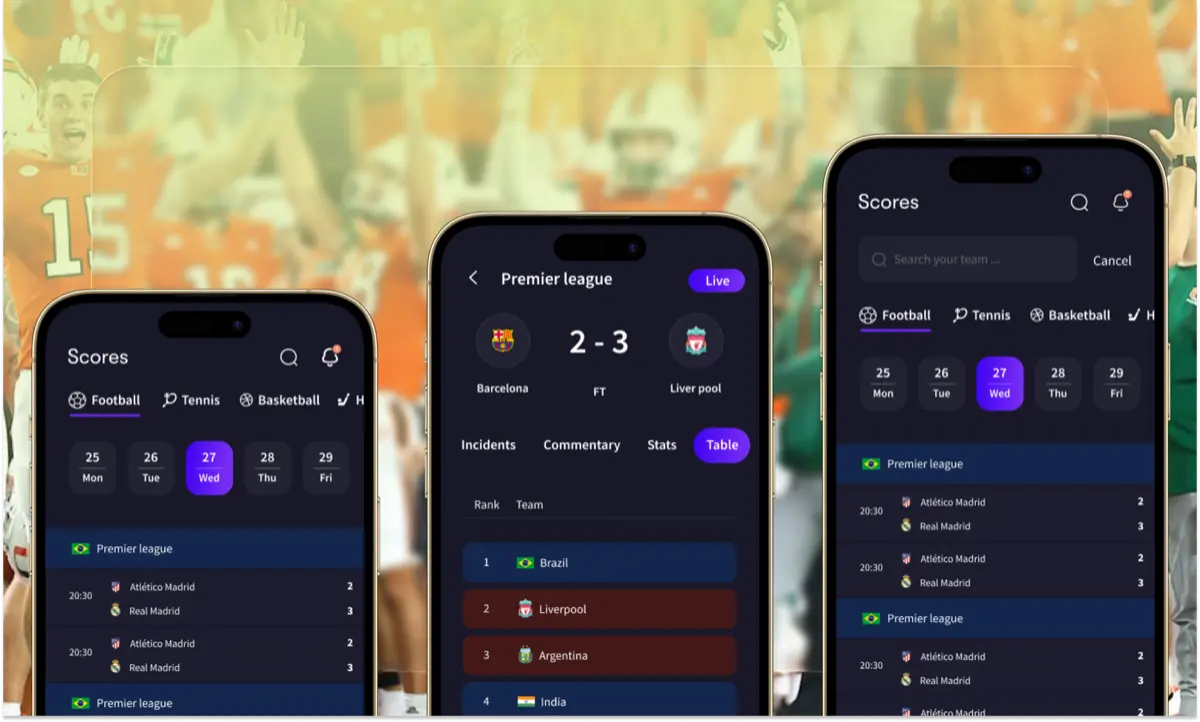
This pattern is expensive everywhere, not just in search. Baymard Institute's benchmark puts average documented abandonment near 70%, and 18% of shoppers report leaving because a flow was too long or too complicated. Discovery carries the same tax: every extra second of confusion spends intent you already paid to acquire.
What the rebuild changed
The rebuild followed one rule: design to explain itself in one scan. Four moves carried it:
- Clearer information hierarchy for faster scanning, with the primary result pattern distinct from everything secondary
- Reduced friction in the primary discovery path, fewer steps between landing and the first meaningful action
- Stronger visual guidance for next steps, so the "conversion-first onboarding path" was visible from the first screen
- Mobile-first layout decisions, because high-intent sessions kept arriving on phones
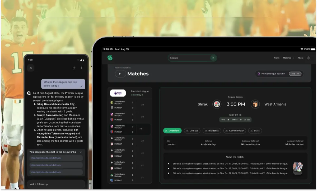
Locking a small component set first — the same discipline from why curation is the job now — kept every screen consistent while the flow changed underneath it.
How we knew it worked
We measured the actions that pay: completion of key discovery steps, time to first value, and repeat search usage. Engagement rose across the core flows, and the team finally had a clean baseline for ongoing CRO iteration instead of debating opinions.
Just as important was the handoff. Developer-ready UI with locked tokens meant the redesign shipped without losing intent in translation, which is where most redesigns quietly die.
The takeaway for founders
If your product has demand but flat engagement, audit the path between arrival and first value before you buy more traffic. Most leaks I find are hierarchy, scanning, and onboarding — the unglamorous trio that decides whether intent converts or evaporates.
Ship the flow that explains itself, measure the actions that pay, and let the numbers argue from there.
Frequently asked questions
The hierarchy was unclear, scanning felt slow, and first-use actions were weak. Users dropped off before reaching the high-intent discovery steps the product was built around.
About the author
mosh
mosh is a product designer for growth, working with design thinking and ever-improving design systems. What matters: fixing conversion, whether in B2B dashboards or direct-consumer apps.
Keep reading
- SaaS activity tracking: designing an admin log teams trust
Admins needed to see every team action in one place. Research with two managers and eight user stories turned a confusing log into filters, search, share, and export.
- GymProLuxe: turning a resistance kit into a training system
GymProLuxe sold trusted hardware but motivation faded after delivery. Premium app UX gave every owner a daily plan matched to their kit.
- You don't have a prompting problem. You have a vocabulary problem
Ben Tossell shipped a style picker because founders can't name what they want — and Google's DESIGN.md proves a shared vocabulary beats a longer prompt every time.